


It might not seem very relevant to the story and outcome of your study, but how you visually present your experimental or statistical results can play an important role during the review and publication process of your article. A presentation that is in line with the overall logical flow of your story helps you guide the reader effectively from your introduction to your conclusion.
If your results (and the way you organize and present them) don’t follow the story you outlined in the beginning, then you might confuse the reader and they might end up doubting the validity of your research, which can increase the chance of your manuscript being rejected at an early stage. This article illustrates the options you have when organizing and writing your results and will help you make the best choice for presenting your study data in a research paper.
Why does data visualization matter?
Your data and the results of your analysis are the core of your study. Of course, you need to put your findings and what you think your findings mean into words in the text of your article. But you also need to present the same information visually, in the results section of your manuscript, so that the reader can follow and verify that they agree with your observations and conclusions.
The way you visualize your data can either help the reader to comprehend quickly and identify the patterns you describe and the predictions you make, or it can leave them wondering what you are trying to say or whether your claims are supported by evidence. Different types of data therefore need to be presented in different ways, and whatever way you choose needs to be in line with your story.
Another thing to keep in mind is that many journals have specific rules or limitations (e.g., how many tables and graphs you are allowed to include, what kind of data needs to go on what kind of graph) and specific instructions on how to generate and format data tables and graphs (e.g., maximum number of subpanels, length and detail level of tables). In the following, we will go into the main points that you need to consider when organizing your data and writing your result section.
Table of Contents:
- Types of Data
- When to Use Data Tables
- When to Use Data Graphs
- Common Types of Graphs in Research Papers
- Journal Guidelines: What to Consider Before Submission
Types of Data
Depending on the aim of your research and the methods and procedures you use, your data can be quantitative or qualitative. Quantitative data, whether objective (e.g., size measurements) or subjective (e.g., rating one’s own happiness on a scale), is what is usually collected in experimental research. Quantitative data are expressed in numbers and analyzed with the most common statistical methods. Qualitative data, on the other hand, can consist of case studies or historical documents, or it can be collected through surveys and interviews. Qualitative data are expressed in words and needs to be categorized and interpreted to yield meaningful outcomes.
Quantitative data example: Height differences between two groups of participants
Qualitative data example: Subjective feedback on the food quality in the work cafeteria
Depending on what kind of data you have collected and what story you want to tell with it, you have to find the best way of organizing and visualizing your results.
When to Use Data Tables
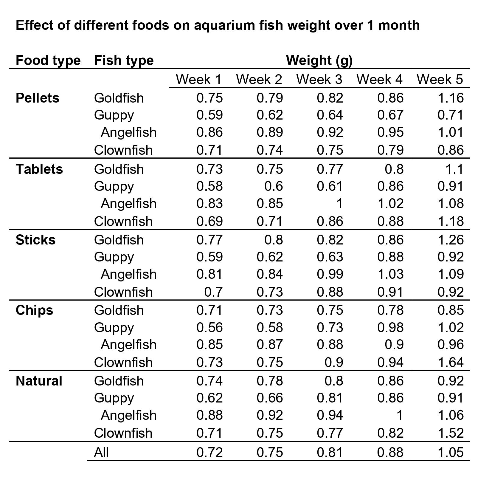
When you want to show the reader in detail how your independent and dependent variables interact, then a table (with data arranged in columns and rows) is your best choice. In a table, readers can look up exact values, compare those values between pairs or groups of related measurements (e.g., growth rates or outcomes of a medical procedure over several years), look at ranges and intervals, and select specific factors to search for patterns.
Tables are not restrained to a specific type of data or measurement. Since tables really need to be read, they activate the verbal system. This requires focus and some time (depending on how much data you are presenting), but it gives the reader the freedom to explore the data according to their own interest. Depending on your audience, this might be exactly what your readers want. If you explain and discuss all the variables that your table lists in detail in your manuscript text, then you definitely need to give the reader the chance to look at the details for themselves and follow your arguments. If your analysis only consists of simple t-tests to assess differences between two groups, you can report these results in the text (in this case: mean, standard deviation, t-statistic, and p-value), and do not necessarily need to include a table that simply states the same numbers again. If you did extensive analyses but focus on only part of that data (and clearly explain why, so that the reader does not think you forgot to talk about the rest), then a graph that illustrates and emphasizes the specific result or relationship that you consider the main point of your story might be a better choice.
When to Use Data Graphs
Graphs are a visual display of information and show the overall shape of your results rather than the details. If used correctly, a visual representation helps your (or your reader’s) brain to quickly understand large amounts of data and spot patterns, trends, and exceptions or outliers. Graphs also make it easier to illustrate relationships between entire data sets. This is why, when you analyze your results, you usually don’t just look at the numbers and the statistical values of your tests, but also at histograms, box plots, and distribution plots, to quickly get an overview of what is going on in your data.
Common Types of Graphs in Research Papers
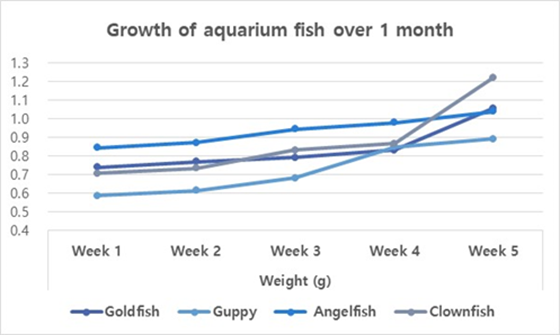
Line graphs
When you want to illustrate a change over a continuous range or time, a line graph is your best choice. Changes in different groups or samples over the same range or time can be shown by lines of different colors or with different symbols.
Example: Let’s collapse across the different food types and look at the growth of our four fish species over time.
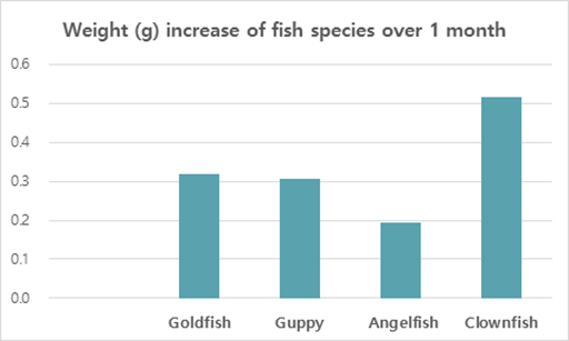
Bar graphs
You should use a bar graph when your data is not continuous but divided into categories that are not necessarily connected, such as different samples, methods, or setups. In our example, the different fish types or the different types of food are such non-continuous categories.
Example: Let’s collapse across the food types again and also across time, and only compare the overall weight increase of our four fish types at the end of the feeding period.
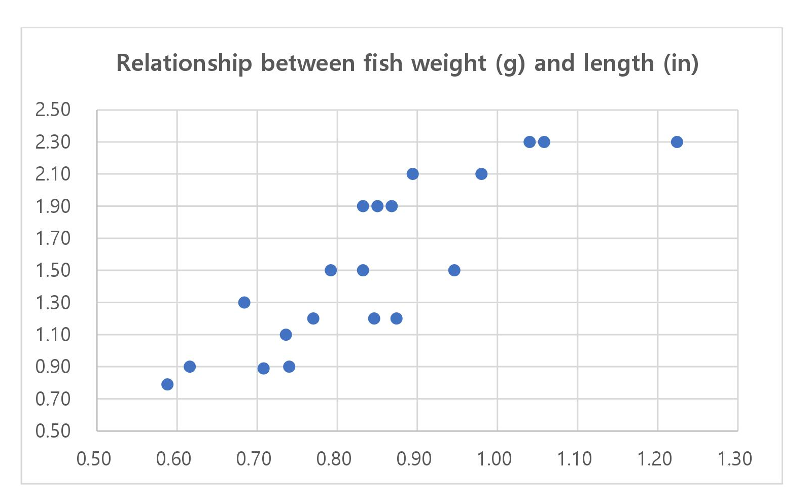
Scatter plots
Scatter plots can be used to illustrate the relationship between two variables — but note that both have to be continuous. The following example displays “fish length” as an additional variable–none of the variables in our table above (fish type, fish food, time) are continuous, and they can therefore not be used for this kind of graph.
As you see, these example graphs all contain less data than the table above, but they lead the reader to exactly the key point of your results or the finding you want to emphasize. If you let your readers search for these observations in a big table full of details that are not necessarily relevant to the claims you want to make, you can create unnecessary confusion. Most journals allow you to provide bigger datasets as supplementary information, and some even require you to upload all your raw data at submission. When you write up your manuscript, however, matching the data presentation to the storyline is more important than throwing everything you have at the reader.
Don’t forget that every graph needs to have clear x and y axis labels, a title that summarizes what is shown above the figure, and a descriptive legend/caption below. Since your caption needs to stand alone and the reader needs to be able to understand it without looking at the text, you need to explain what you measured/tested and spell out all labels and abbreviations you use in any of your graphs once more in the caption (even if you think the reader “should” remember everything by now, make it easy for them and guide them through your results once more). Have a look at this article if you need help on how to write strong and effective figure legends.
Journal Guidelines: What to Consider Before Submission
Even if you have thought about the data you have, the story you want to tell, and how to guide the reader most effectively through your results, you need to check whether the journal you plan to submit to has specific guidelines and limitations when it comes to tables and graphs. Some journals allow you to submit any tables and graphs initially (as long as tables are editable (for example in Word format, not an image) and graphs of high enough resolution.
Some others, however, have very specific instructions even at the submission stage, and almost all journals will ask you to follow their formatting guidelines once your manuscript is accepted. The closer your figures are already to those guidelines, the faster your article can be published. This PLOS One Figure Preparation Checklist is a good example of how extensive these instructions can be – don’t wait until the last minute to realize that you have to completely reorganize your results because your target journal does not accept tables above a certain length or graphs with more than 4 panels per figure.
Some things you should always pay attention to (and look at already published articles in the same journal if you are unsure or if the author instructions seem confusing) are the following:
- How many tables and graphs are you allowed to include?
- What file formats are you allowed to submit?
- Are there specific rules on resolution/dimension/file size?
- Should your figure files be uploaded separately or placed into the text?
- If figures are uploaded separately, do the files have to be named in a specific way?
- Are there rules on what fonts to use or to avoid and how to label subpanels?
- Are you allowed to use color? If not, make sure your data sets are distinguishable.
If you are dealing with digital image data, then it might also be a good idea to familiarize yourself with the difference between “adjusting” for clarity and visibility and image manipulation, which constitutes scientific misconduct.
And to fully prepare your research paper for publication before submitting it, be sure to receive proofreading services, including journal manuscript editing and research paper editing, from Wordvice’s professional academic editors.